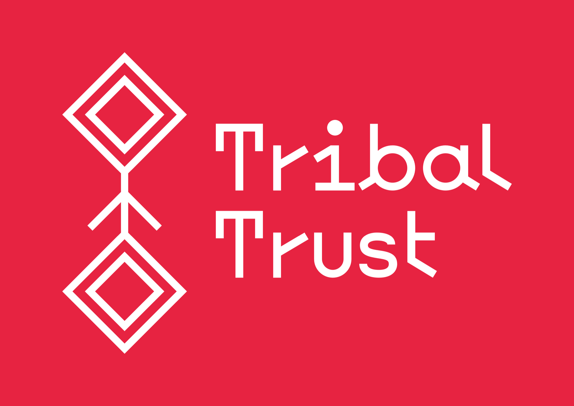
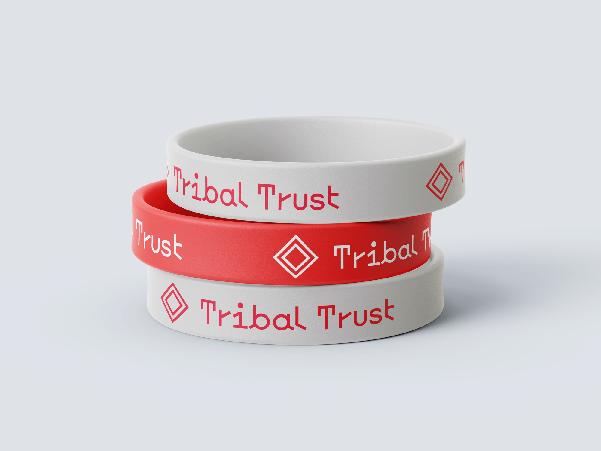
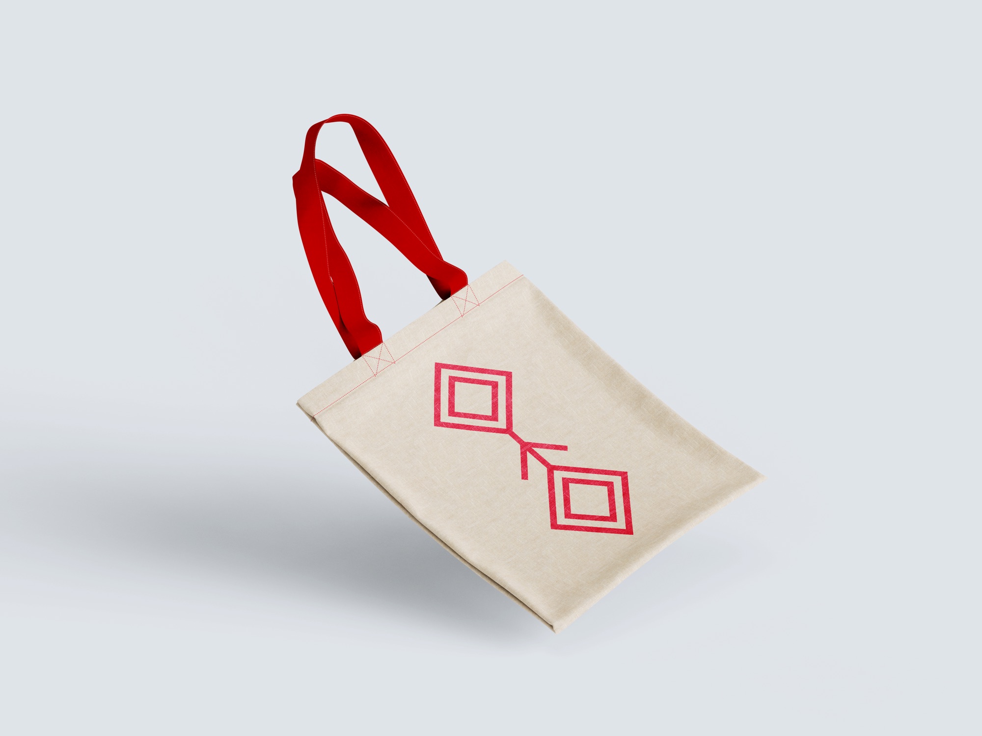
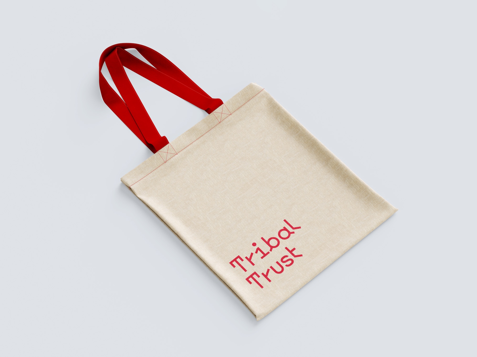
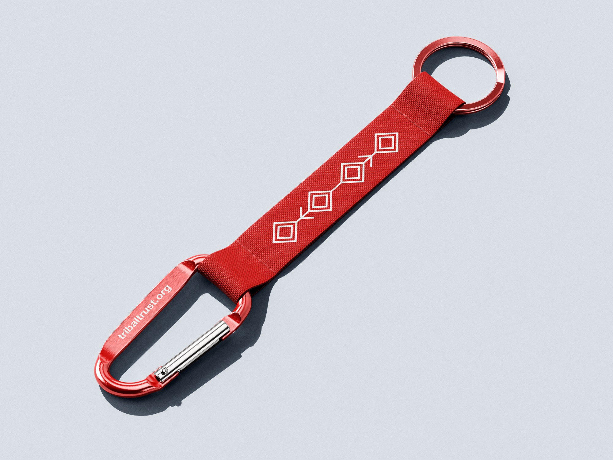
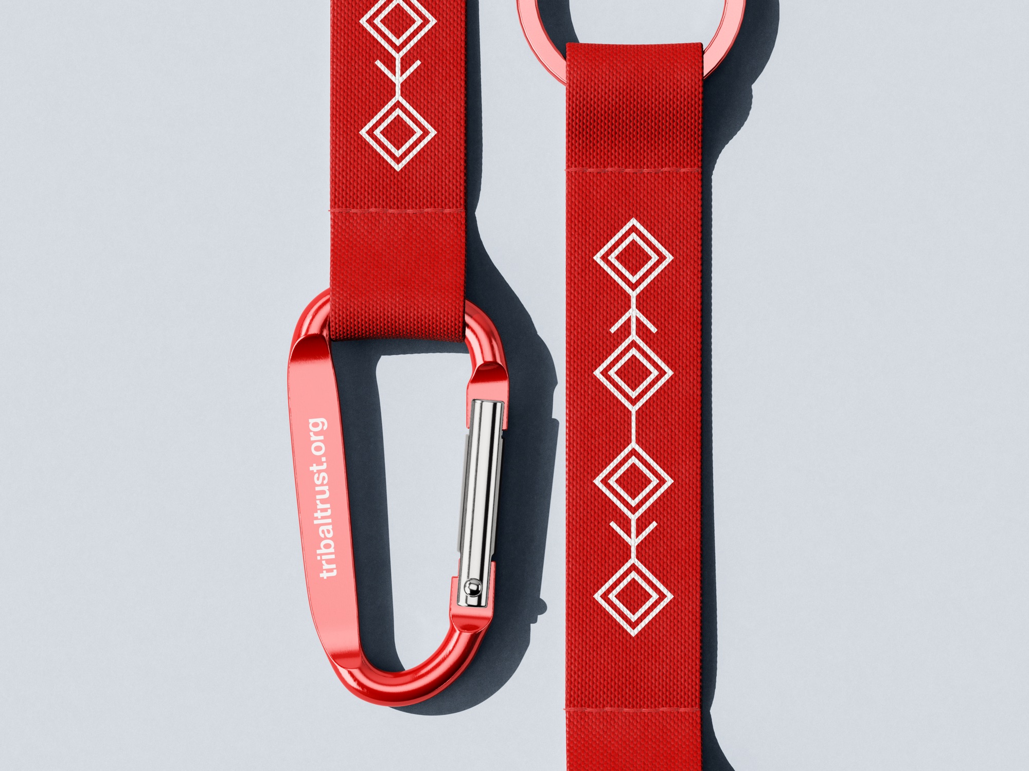
Tribal Trust is a paid logo commission, awarded through a competition run by Leeds Arts University, which I won, for Aotea Global, an organisation which aims to mitigate climate change and improve food security in African nations. After the leader of the Higaonon Tribe contacted Aotea Global for help fundraising, Tribal Trust was born to help the ancient tribe in the Philippines raise money so they would not have to sell their land to corporate mining companies. The brief called for a logo that communicates the concept of helping protect ancient tribal lands around the world for future generations, one small square at a time.
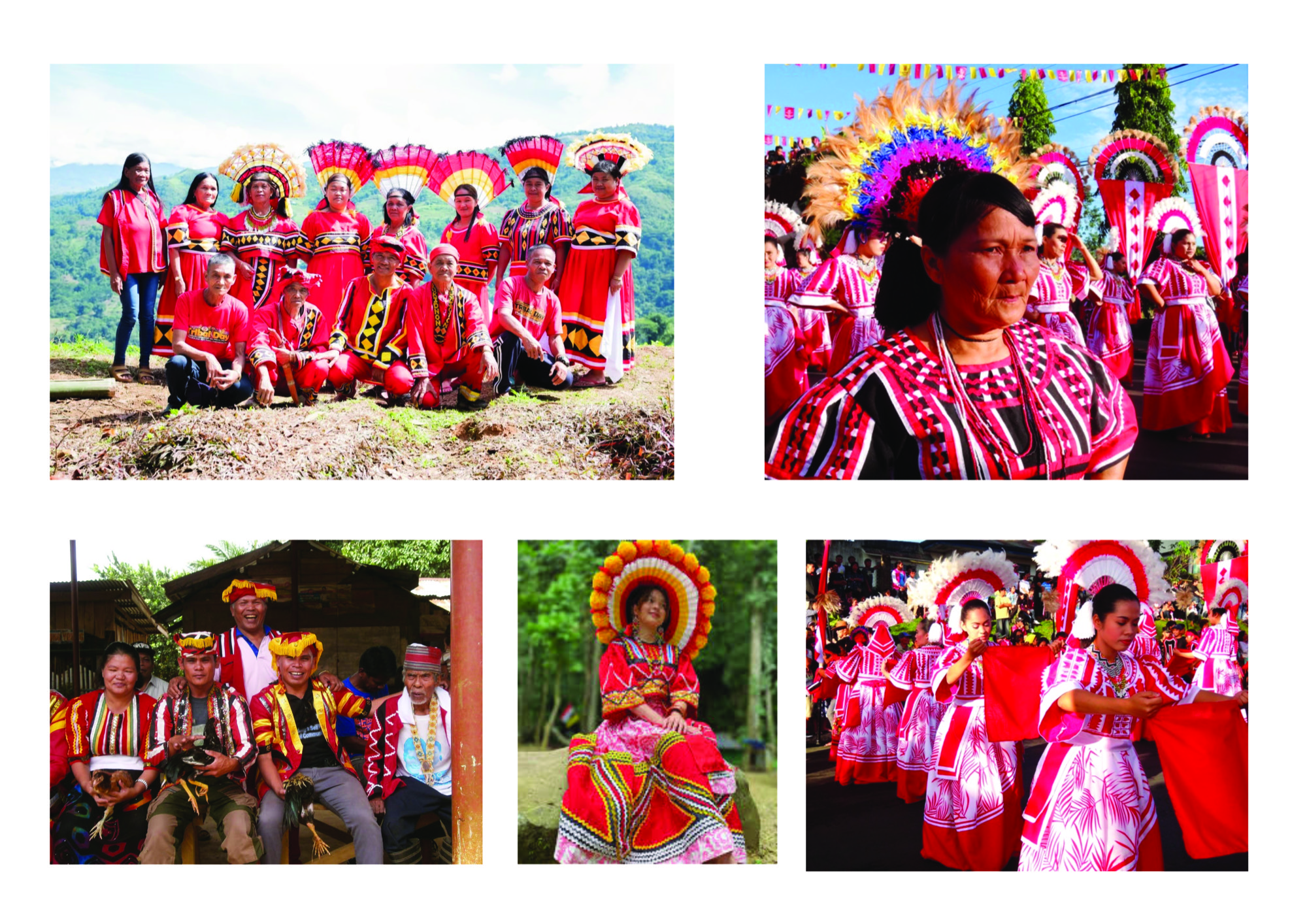
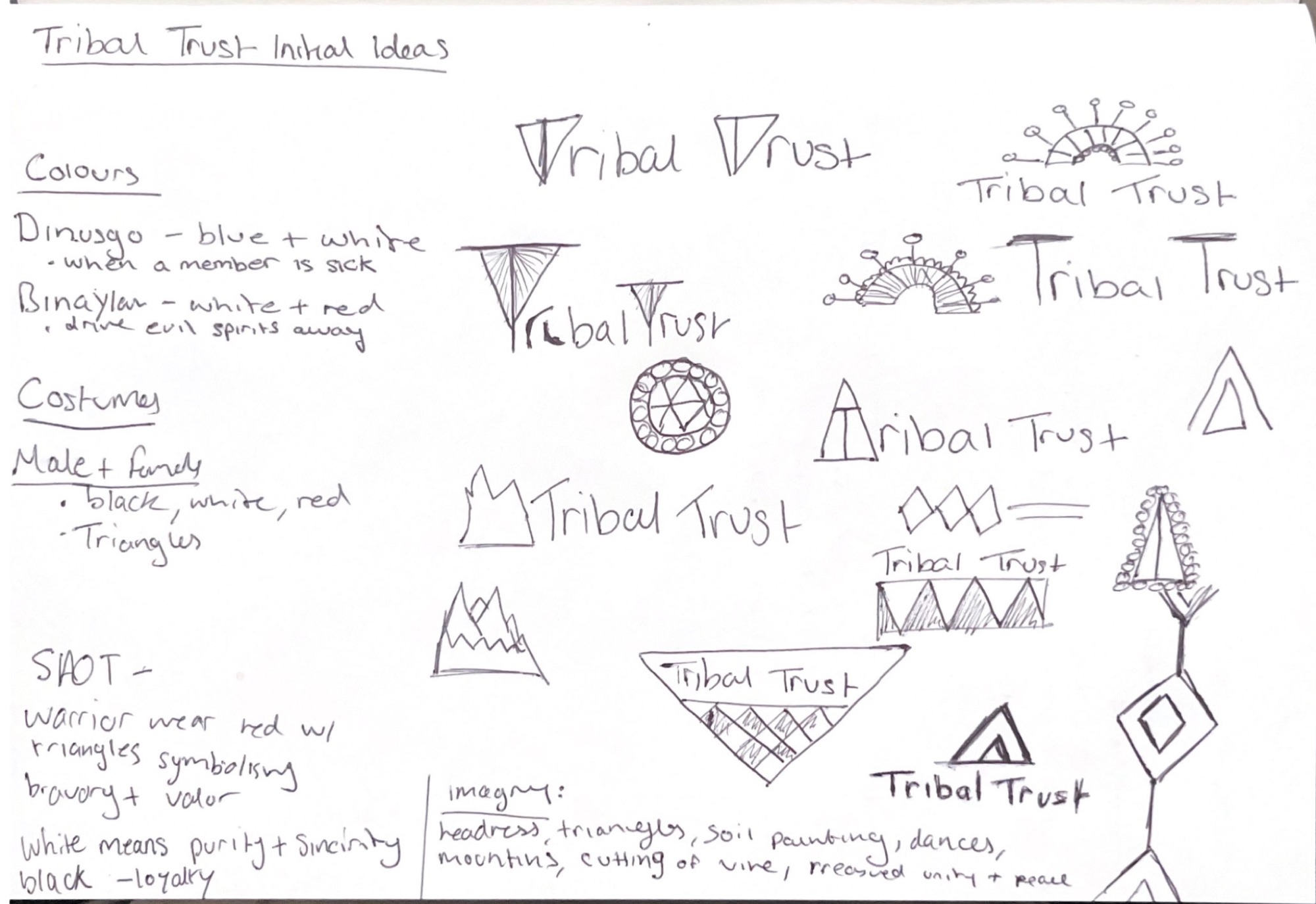
When beginning research, I felt it important to focus on the Higaonon Tribe, rather than their ancestral lands, which they are trying to protect. This was because the Higaonon culture was what made them unique amongst other ancient tribes living in the Philippines. Whilst researching, I found some significant topics worth exploring in a design context. These included the red colours that are synonymous with the Higaonon Tribe, which represent the bravery to protect their tribe, and white, which represents purity and sincerity of beliefs. Another two were a ritual they have where they cut a rattan vine to settle feuds, and the diamond shapes tribespeople wear on their clothing; the more diamond shapes, the more senior they are. The women of the tribe also wear a headdress called the Panika, which represents preserving their rich traditions.
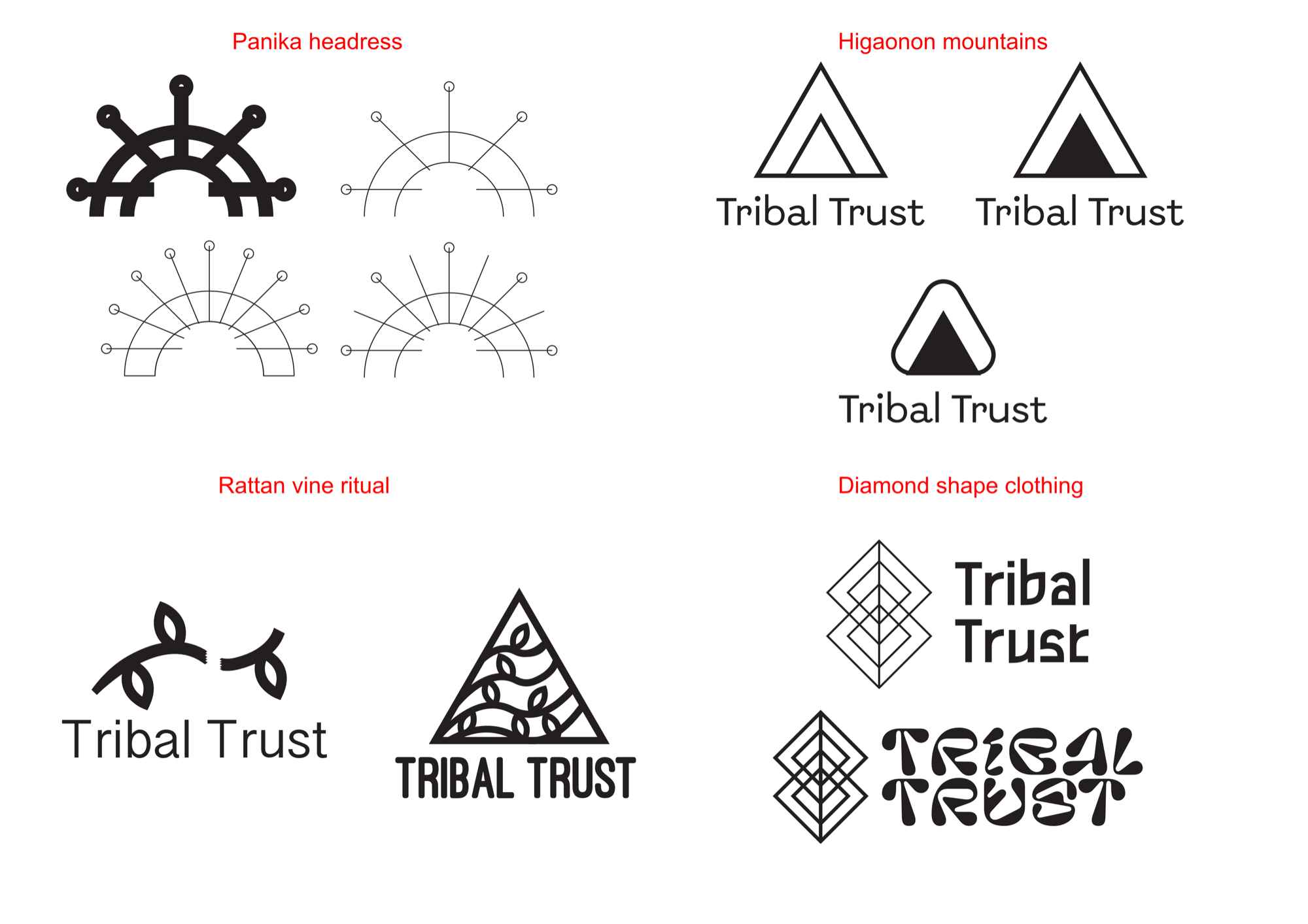
Earlier iterations explored using the vine ritual research as a reference point for the logo, with the aim of visually communicating a logo which represents an ancient tribe with ancient traditions and customs. This approach was abandoned early because the details of the ritual are quite violent, and I did not believe this would work well for a charity organisation. Another method I tried was using the literal translation of the Higaonon, which means mountain people, to create a mountain symbol. This approach had strong conceptual links to the Higaonon Tribe, but the outcomes looked more like an app icon rather than a charity logo. To consider less obvious approaches, I started to use the Panika as a visual reference for a logo design. This was a strong concept which links the logo back to representing the protection of their rich traditions. This was abandoned as, without the context, the message was not being communicated strongly enough.
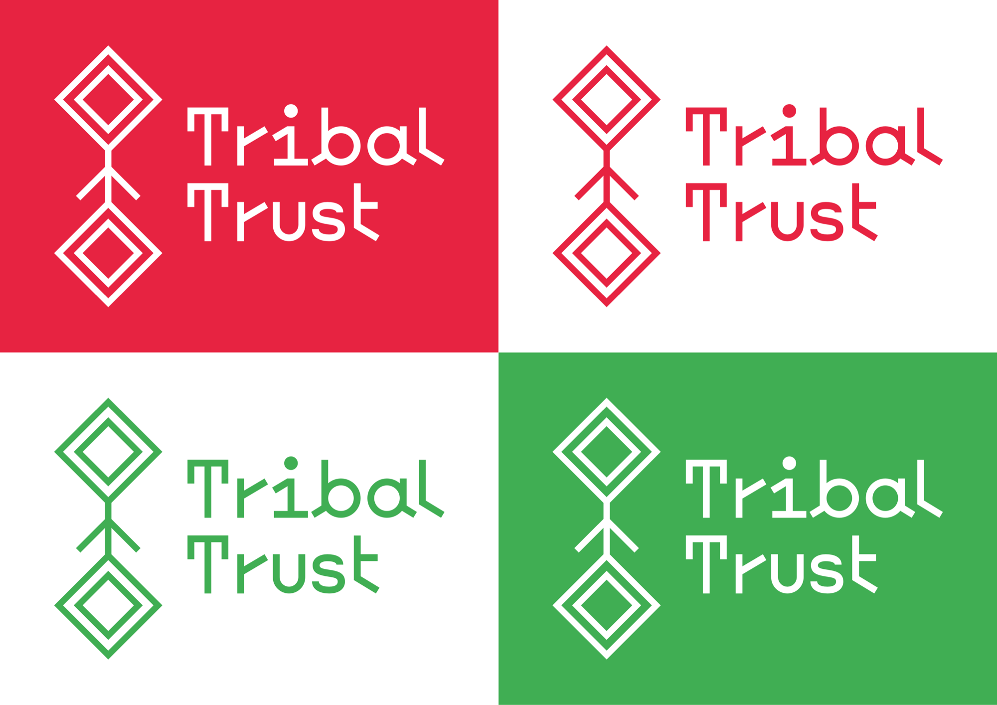
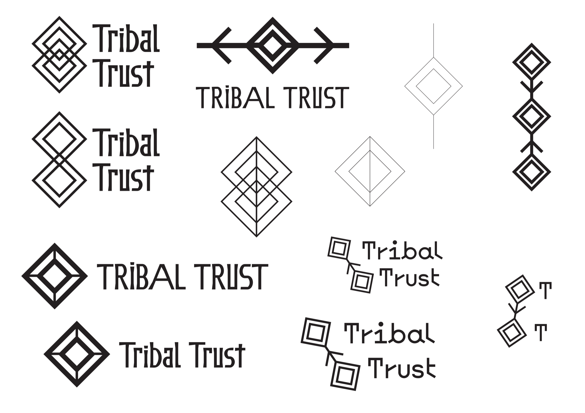
The final approach I explored was using the diamond shapes from Higaonon attire. This was the strongest exploration because the diamond shapes directly link back to representing the Higaonon Tribe whilst also being able to stand alone as a reliable logo shape, with no context. I paired this with the Heal The Web B typeface, as the irregular shape of the letterforms adds an organic and warm feel, suitable for a charity organisation dedicated to helping ancient tribes. Red and white were used as a duotone colour palette, as red in the Higaonon Tribe represents bravery, and white represents purity and sincerity of beliefs.
This was a successful response to the brief, as the leader of the Higaonon selected this design from submissions by multiple designers. The diamond geometric shapes of the logo have strong conceptual links to the attire of the Higaonon, with the red and white colour palette visually communicating the bravery and sincerity of their beliefs to protect their ancient tribal lands, as the brief called for. If given the opportunity, I would like to expand this project further into a full brand identity, exploring how the logo would work across a range of platforms.