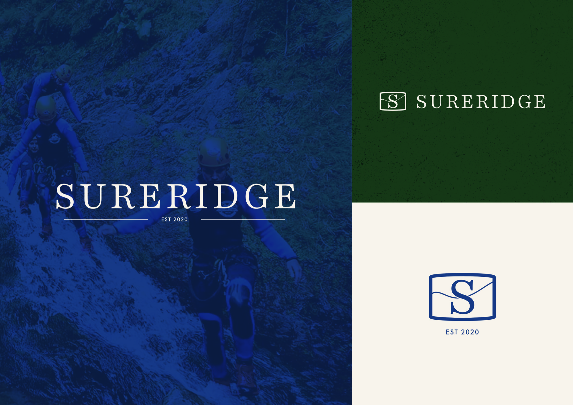
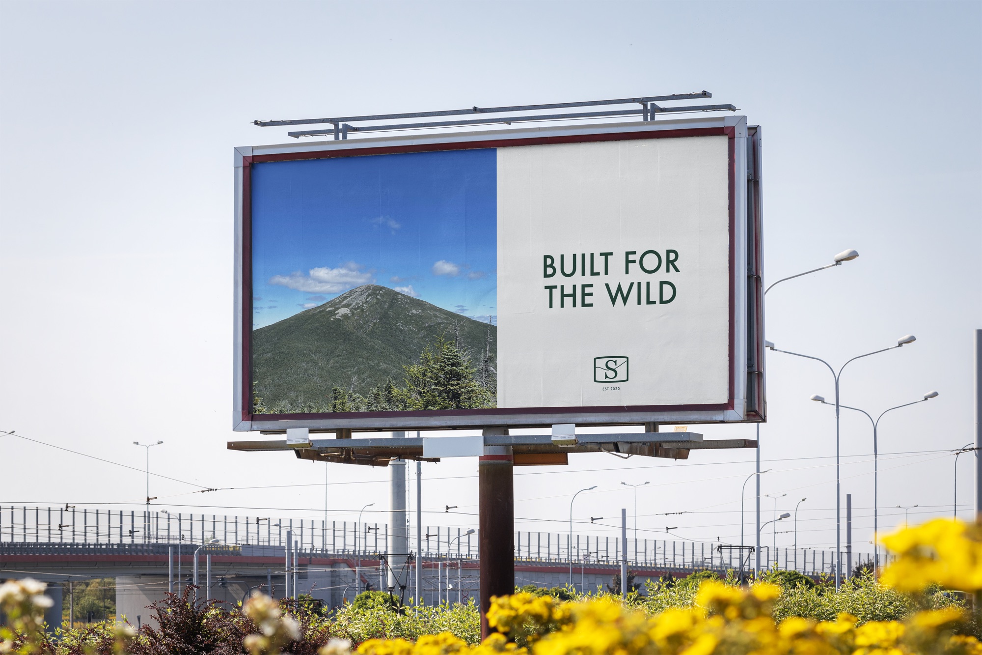
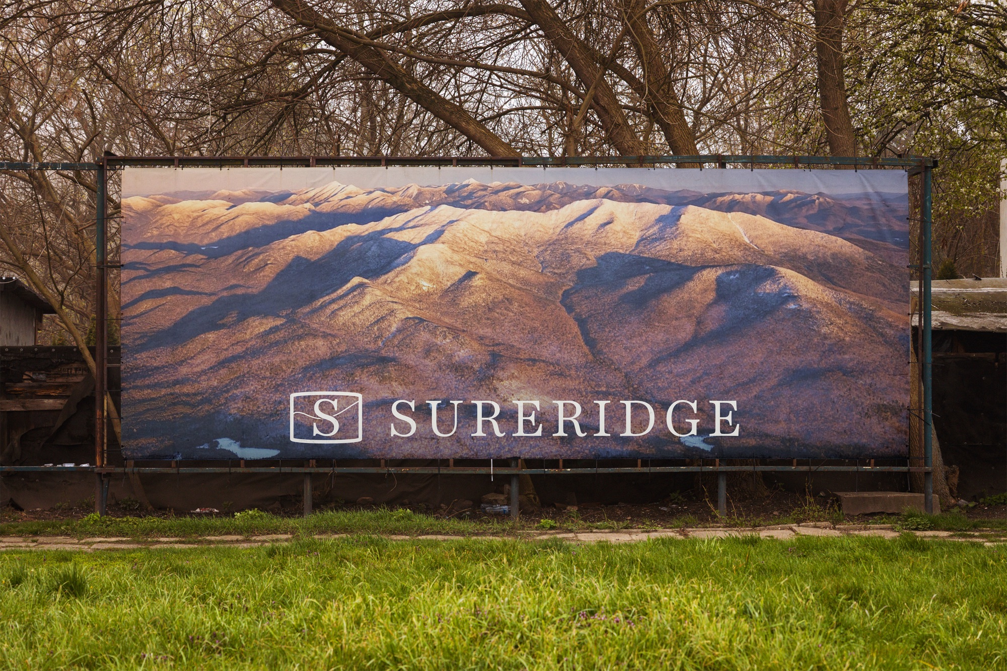
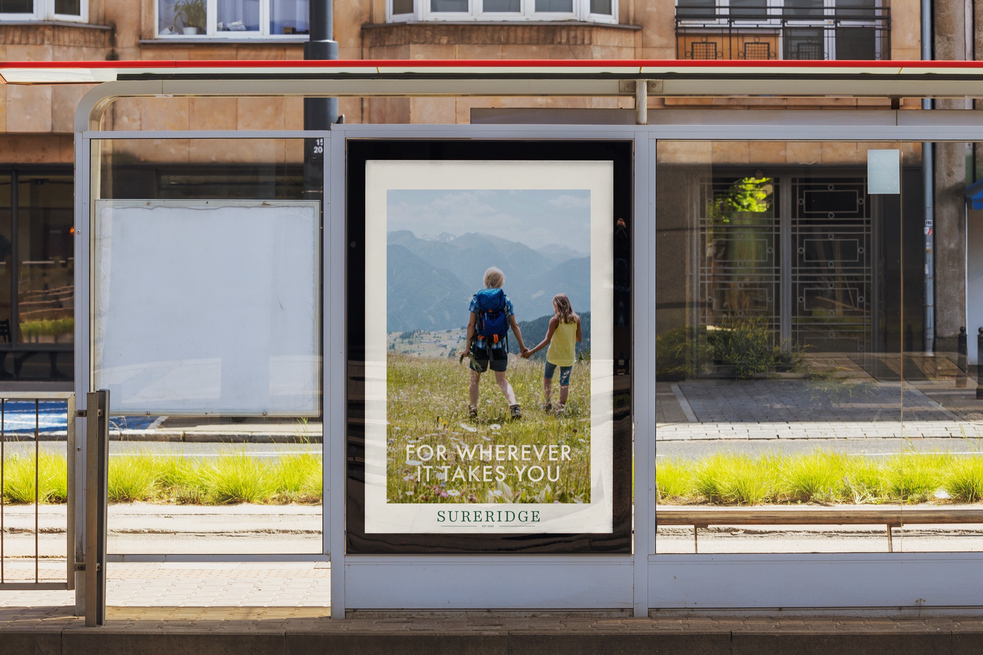
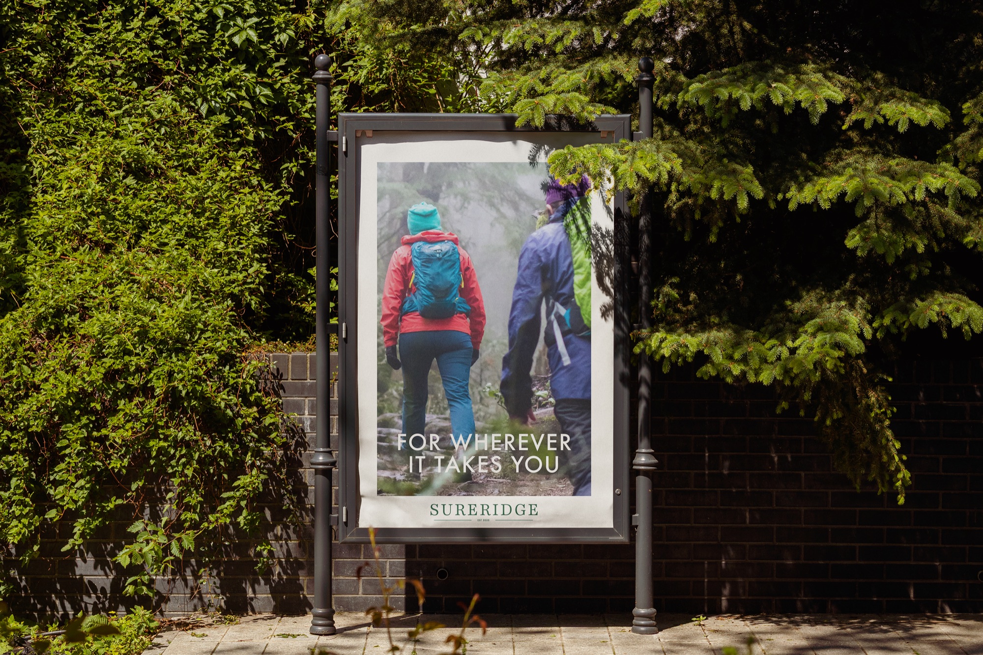
Sureridge is a self-initiated brief from BriefBox, which aims to create a complete brand identity for a luxury outdoor clothing and supplies company which promotes and enables an adventurous outdoors lifestyle. The brief asked for an identity which simultaneously communicates the quality of a brand like Ralph Lauren with the endurance of a brand like Patagonia. Alongside this, design decisions were made to link the brand back to its roots in Upstate New York. The brief asked for multiple logo variations, POS poster designs and a brand specification page.
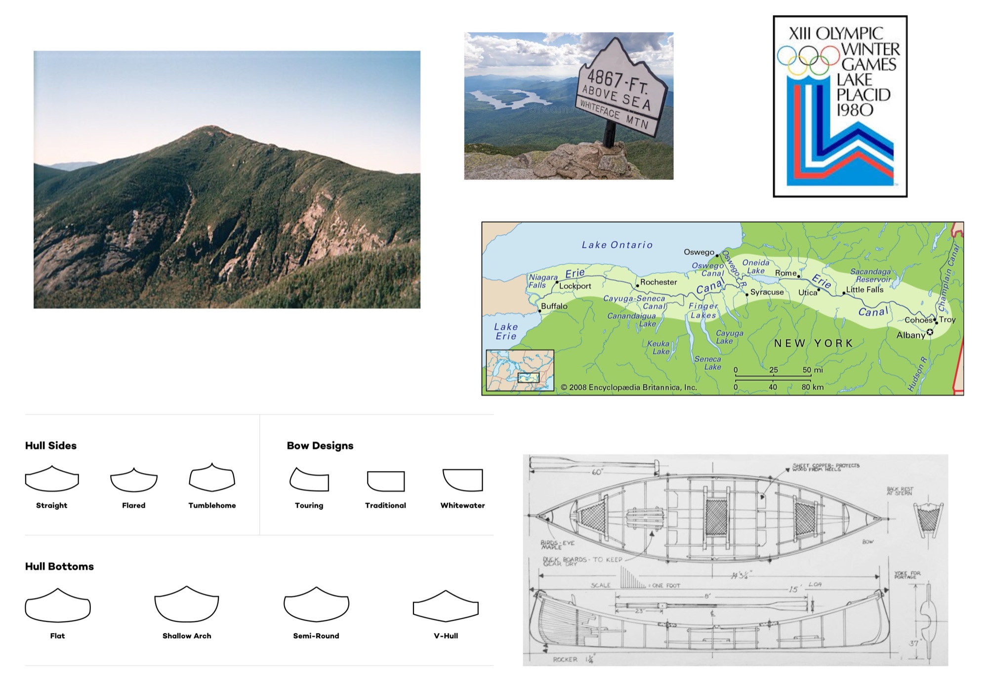
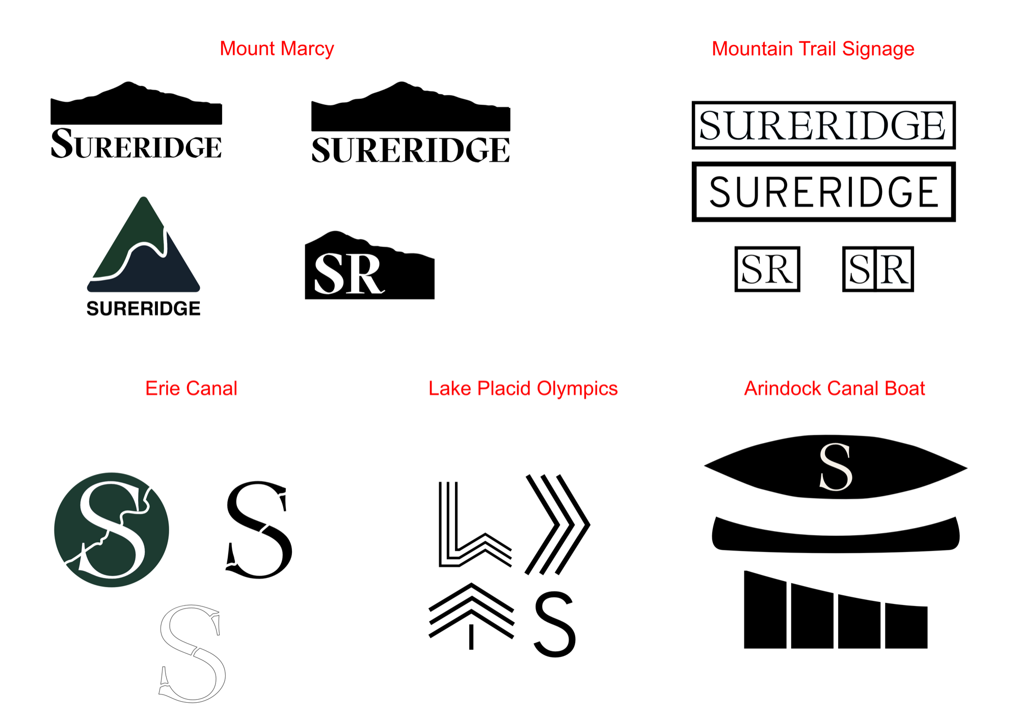
Research began by looking into the geography and culture of Upstate New York to ensure a link to the brand's heritage. Key references I identified were Mount Marcy, the highest peak in New York, the Erie Canal and the Adirondack wilderness. These references have the potential to push this identity past a standard luxury outdoors company to a brand identity firmly tied to its roots.
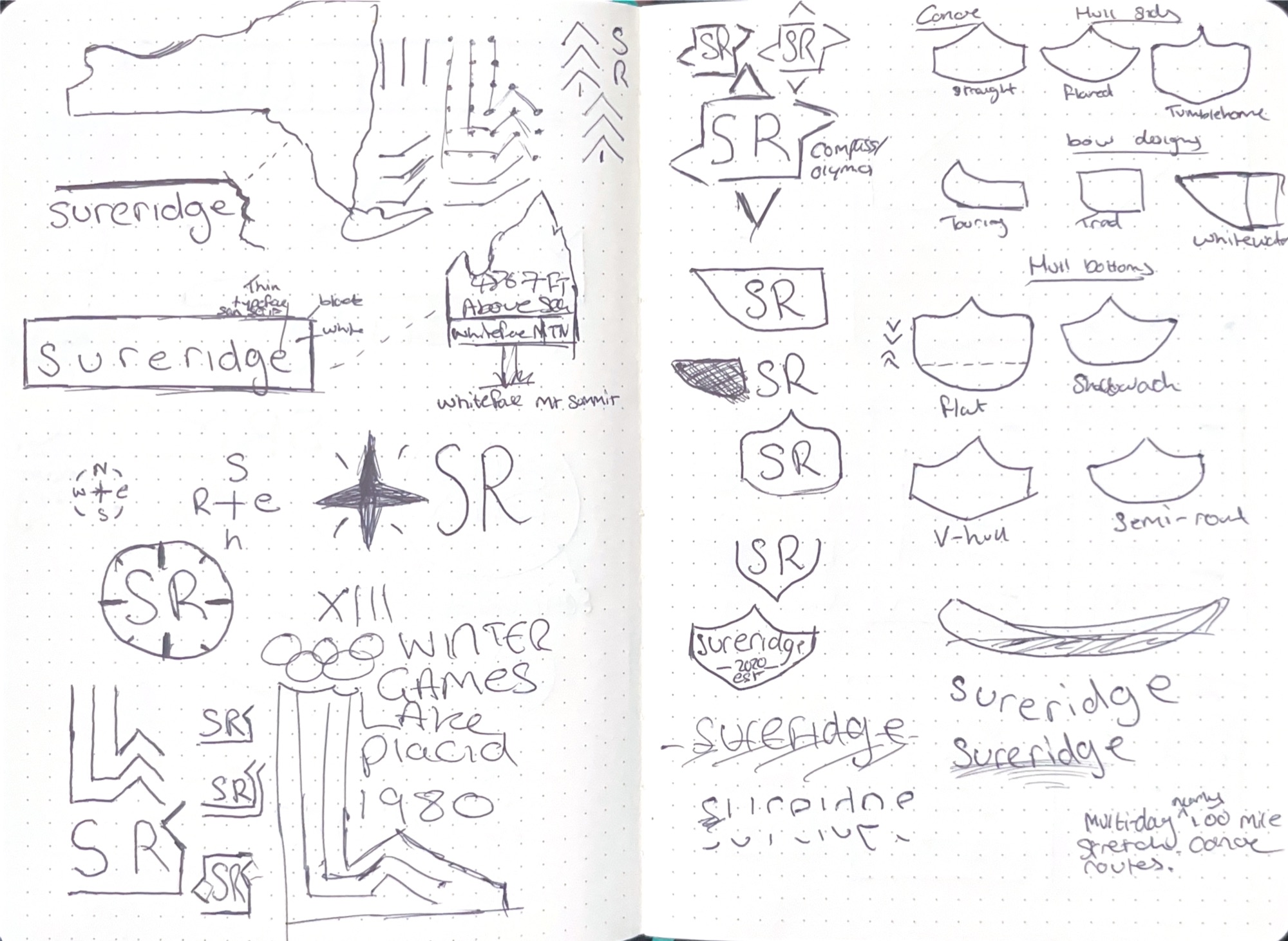
Earlier iterations in the design process explored using a silhouette of Mount Marcy in the aim of creating an enduring brand identity that is closely linked to Upstate New York, like Mount Marcy itself. This was abandoned as Mount Marcy was not recognisable and just looked like another mountain peak. I believed this could be pushed further to a closer tie to Upstate New York. Another approach I explored was using the geometric shapes of the 1980 Olympics at Lake Placid, but I quickly realised the geometric shapes, whilst linked to an important historical moment for Upstate New York, failed to visually communicate a luxury brand identity. A different angle I explored was using signage from mountain trails found around Upstate New York. This created a clean logotype with strong links to outdoor activities in Upstate New York, but still failed to communicate that the brand was high-end.
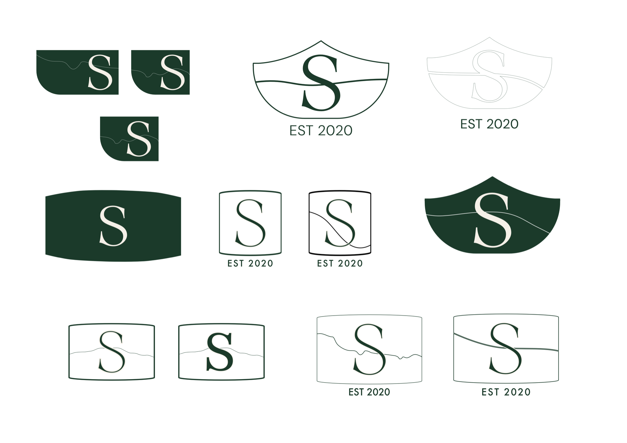
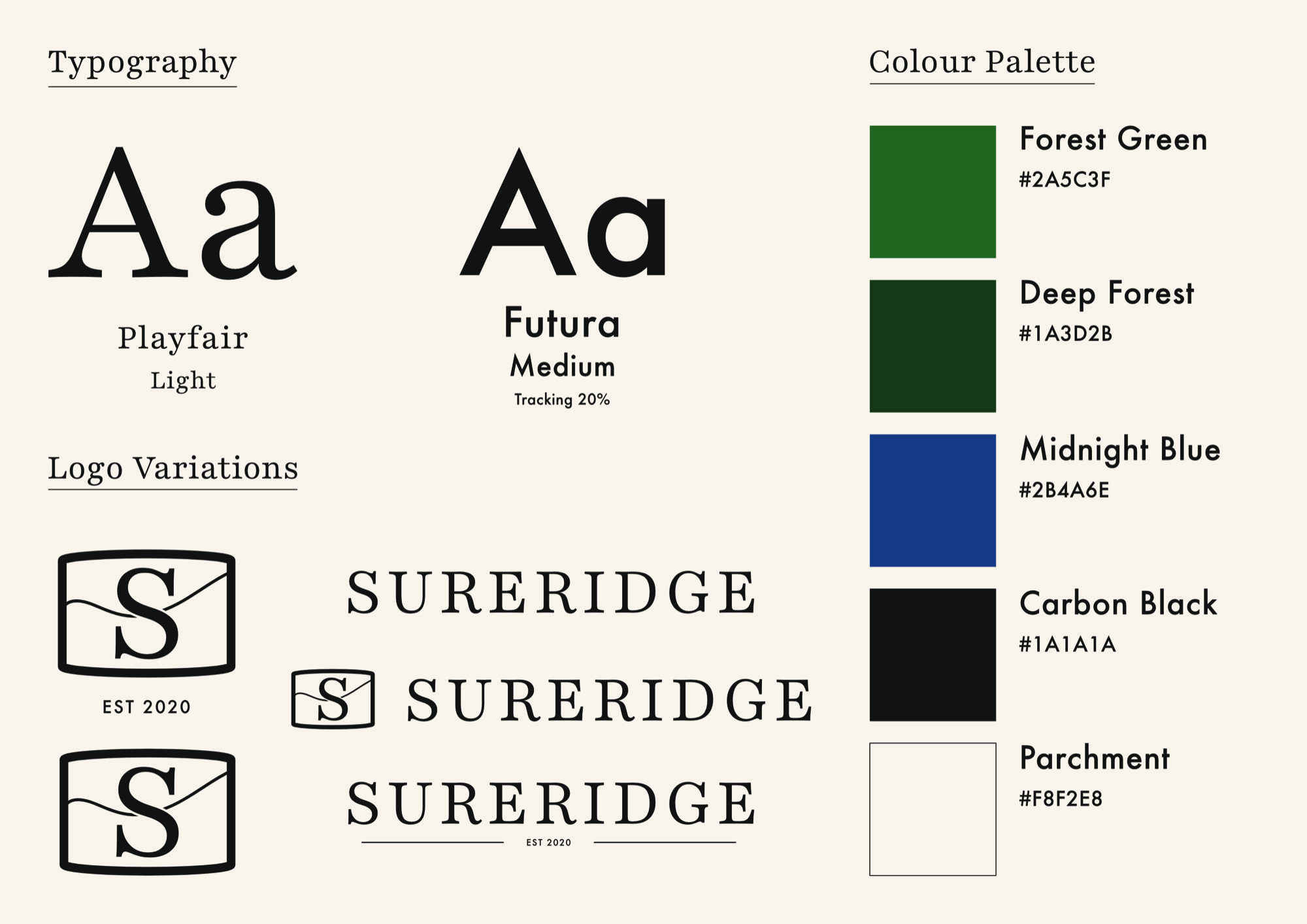
Eventually, I began exploring using the Adirondack Canal Boat, a vessel historically linked to Upstate New York, as a reference to create shapes for a logo. This allowed for a logo shape which was visually recognisable as the historical vessel, yet versatile enough to be effective as part of the brand identity working across a range of mediums like clothing, print or digital. I also incorporated the Erie Canal iterations into these designs with the aim of further tying the design conceptually to Upstate New York and outdoor activities, whilst creating a more recognisable logo. Playfair Light was used with the aim of visually communicating a more premium brand to complement the durable design of the logo shape. These two contrasting elements can be used together or separately in the logo variations to change the levels of premium or durability being communicated, depending on what is needed, either for a marketing campaign or a new clothing line. Futura Medium was used to better meet the Ralph Lauren meets Patagonia requirement asked for in the brief by complementing Playfair Light and adding clarity and confidence in use for marketing campaigns. The colour palette was chosen to further communicate a premium brand, with Forest and Deep Green being used as a direct reference to the Adirondack wilderness and Midnight Blue as an alternative colourway to add depth whilst still complementing the rest of the palette. Parchment and Carbon black were used as an alternative to pure white and black to keep the colour palette warm and give the identity a heritage, tactile quality.
Sureridge as a brand identity meets the requirements of the brief to be a mix of quality and luxury, similar to Ralph Lauren and Patagonia. This is achieved through the Adirondack Canal Boat and Erie Canal logo shape, which directly ties the identity to the origins of Sureridge in Upstate New York, paired with the delicacy Playfair Light. This juxtaposition between type and logo creates the blend of resilience and luxury required by the brief, with the warmth of the colour palette adding to this and cultural and historical references within the identity uniquely tie it towards its heritage in Upstate New York, whilst being versatile across a range of mediums. Given more time for this project, I would have further explored how the logo works on a digital platform, such as website headers or an email newsletter, as the final outcomes currently focus on the brand identity in a print format.