Proof is a self-initiated project, briefed to create a browser-based word game that reimagines hangman in a typographic approach and to make learning type terms visually engaging for creatives. The brief asked to create a working game system with a logo and visual identity. Constraints of the brief were to use no illustrations or imagery, only type to communicate the game state. All designs were created by me, but the code was built in the browser using Claude Code.
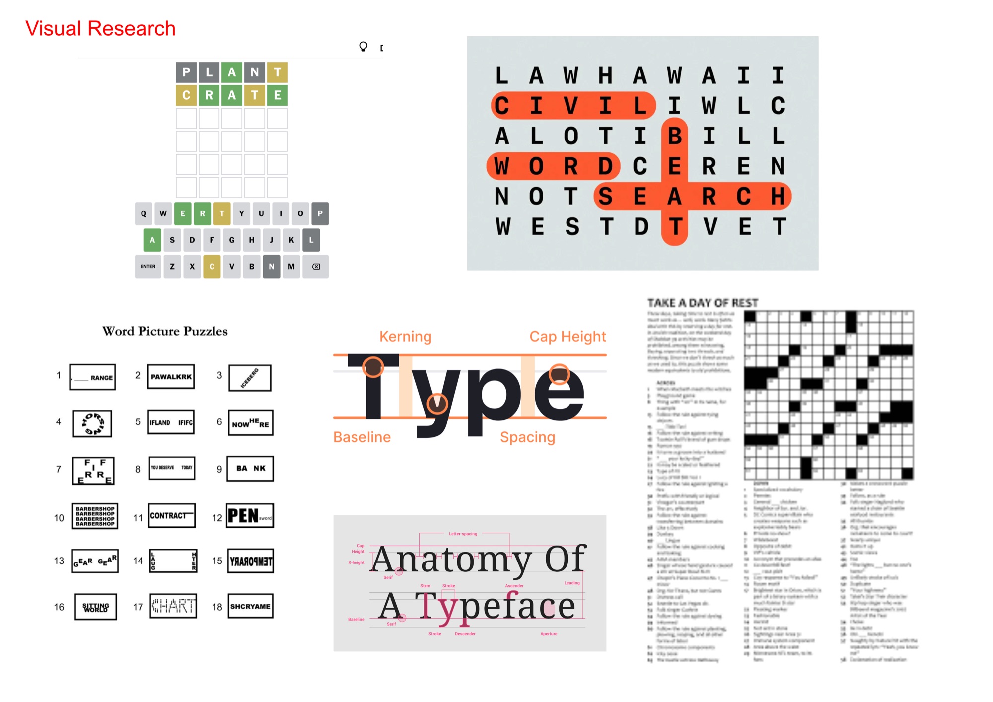
Research started with looking at existing word games and approaches to typography education. I noticed that popular word games, like Wordle, and typographic anatomy infographics both use colour as the main method of visual communication for key information. Another similarity between the two, was that an editorial approach is taken in both, with a print feel to both word games and infographics. Practically, I started researching the use of Claude Code to create the code, using my Figma designs, as I have no coding experience.
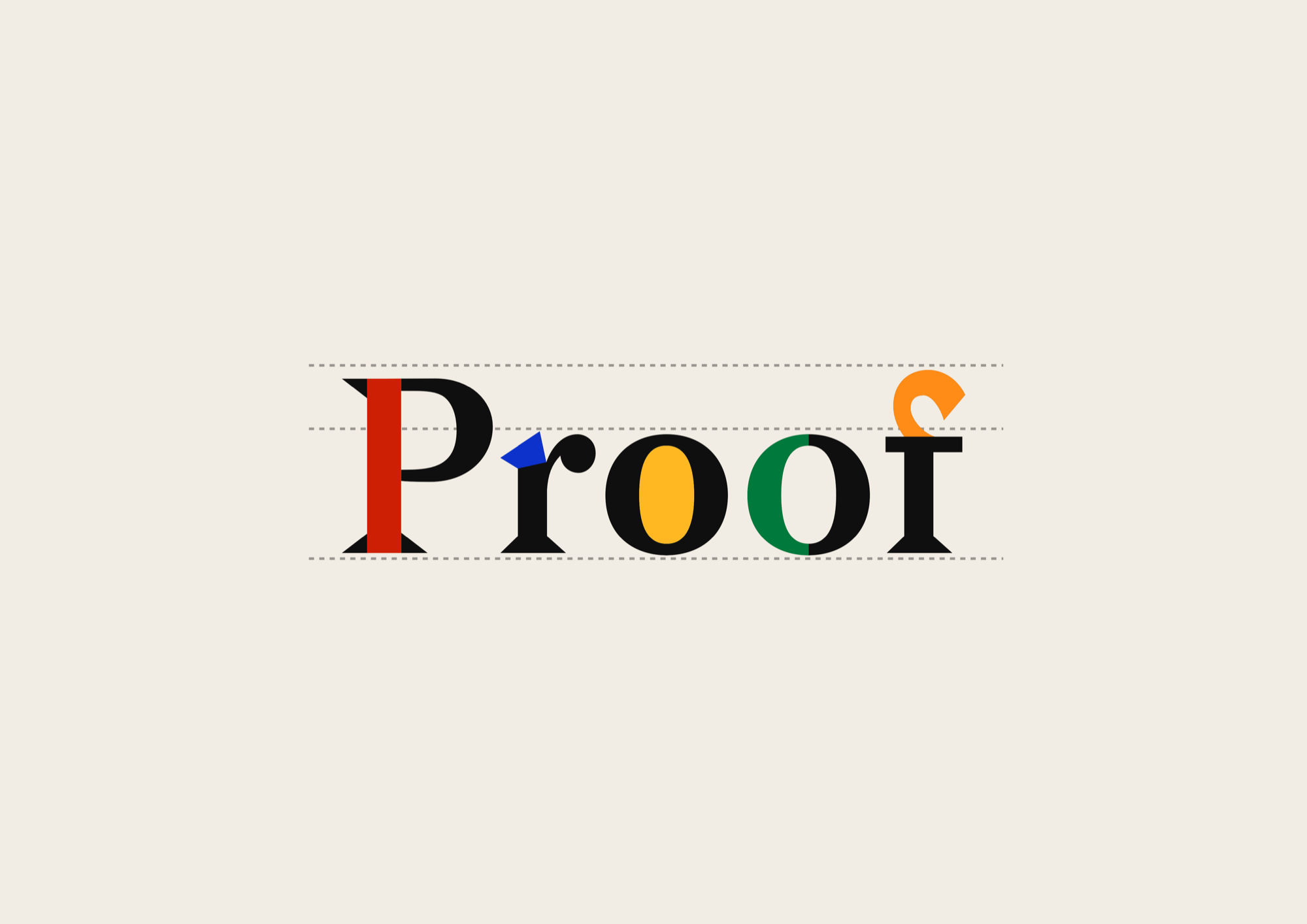
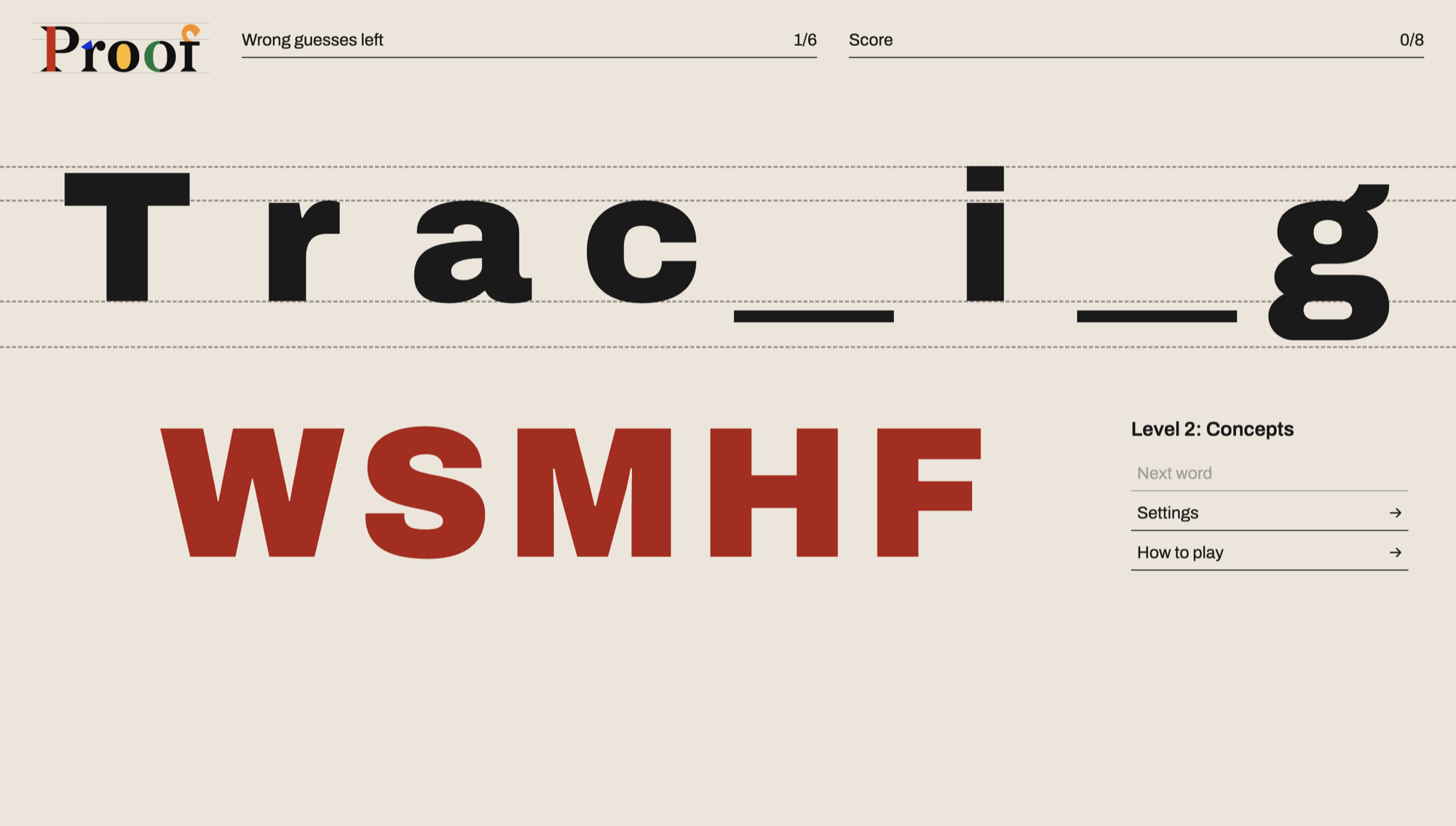
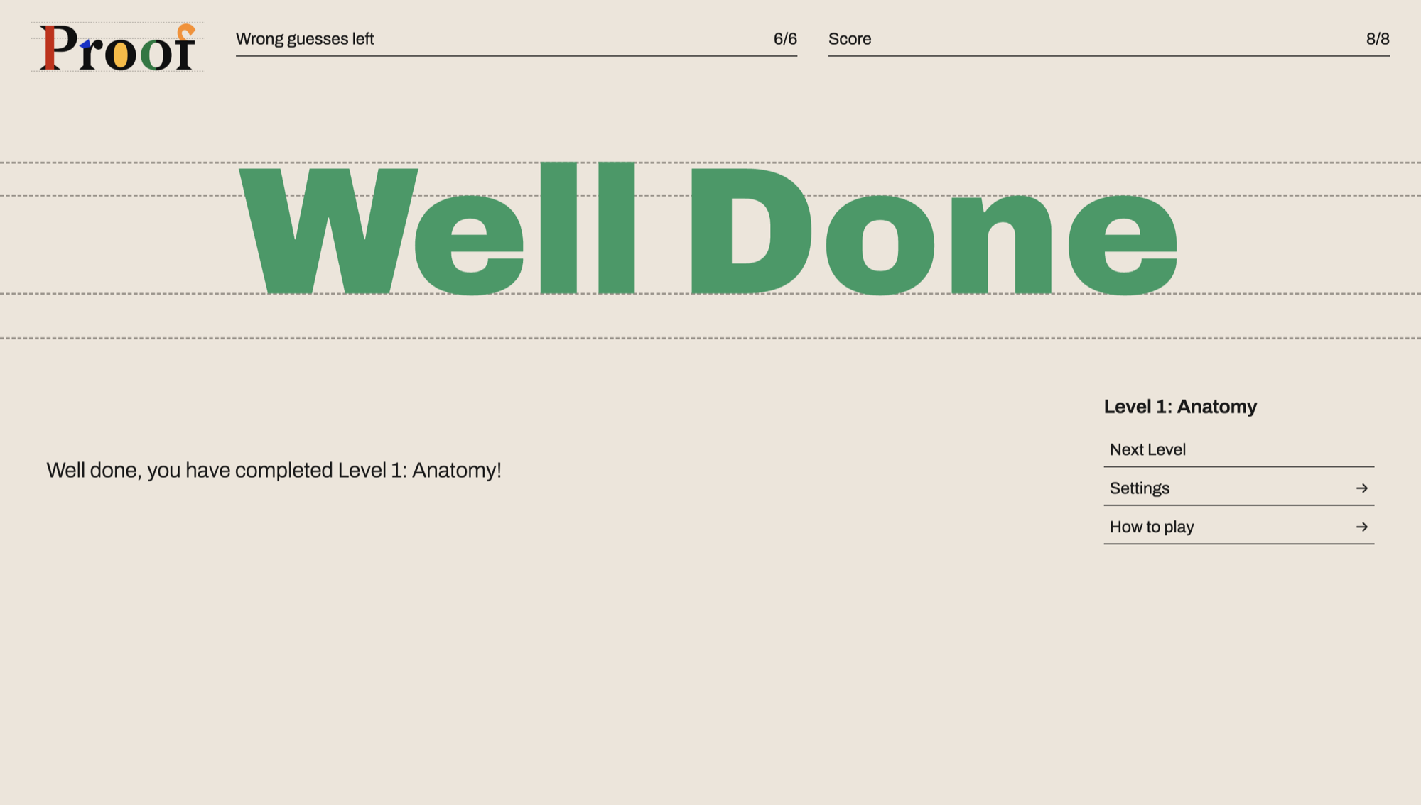
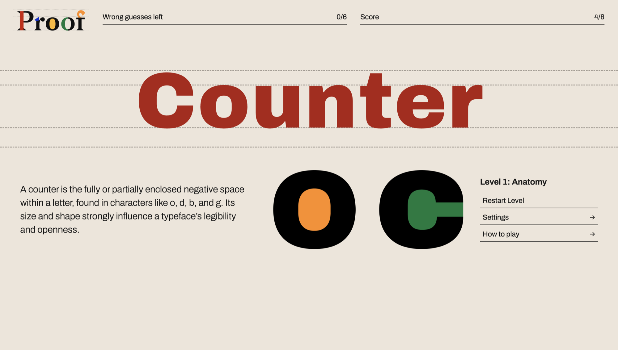
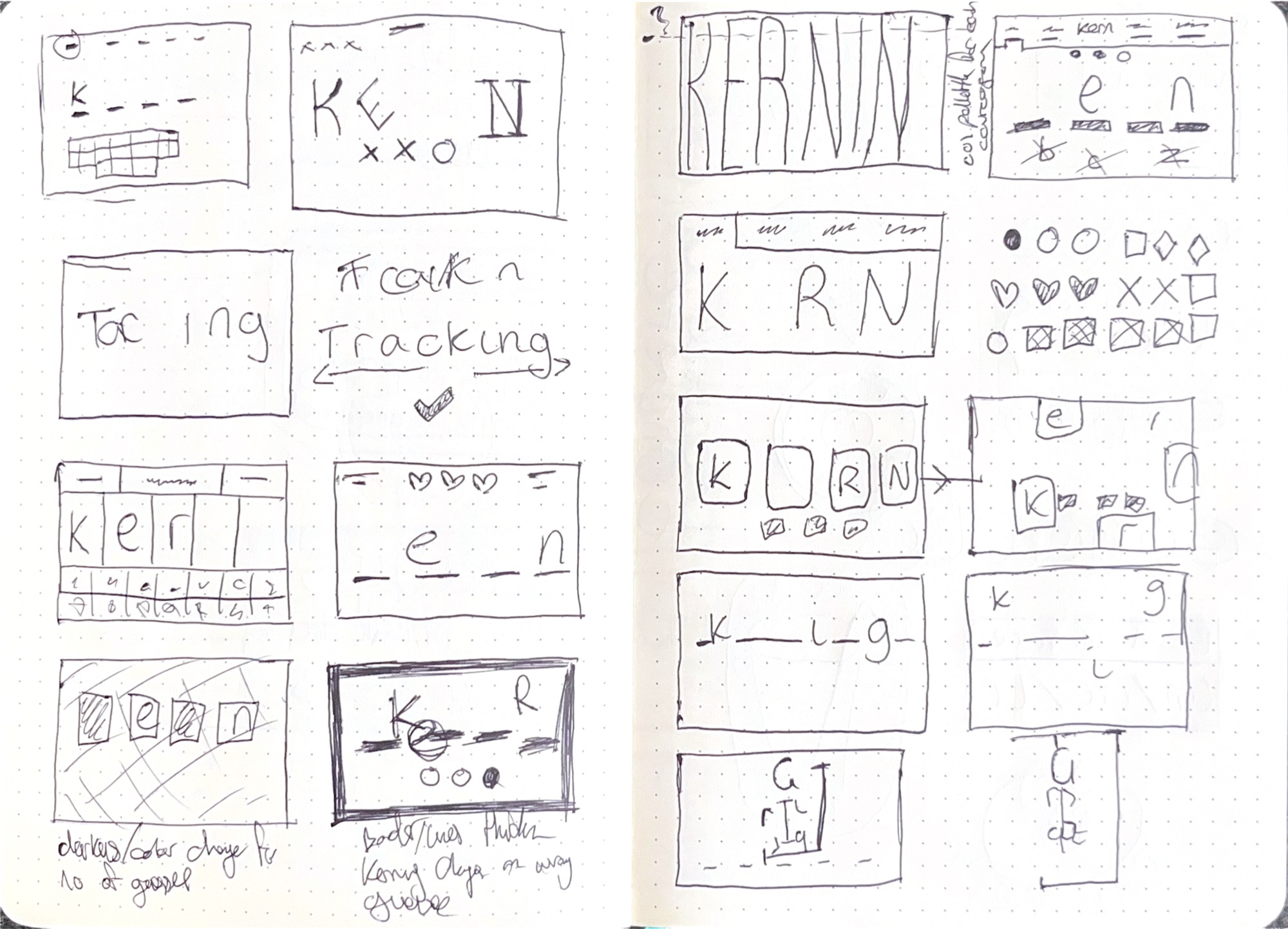
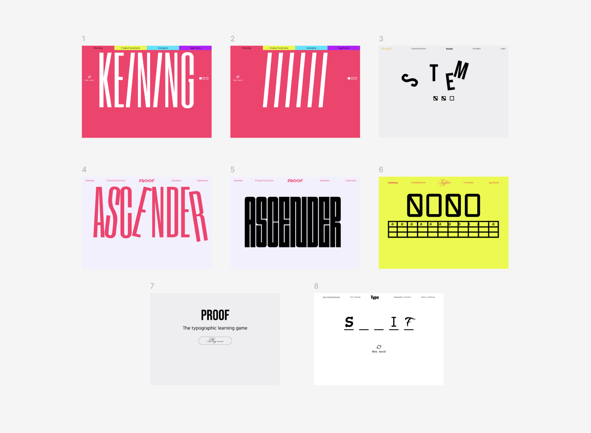
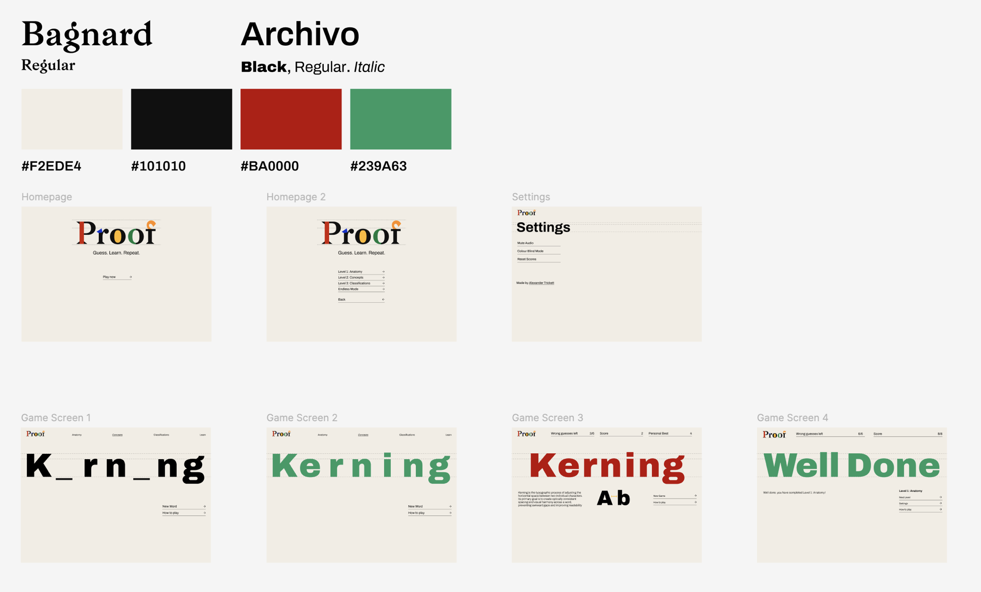
Earlier iterations explored using different typefaces for each letter and although this was visually interesting and communicated the variety of font families, it was too inconsistent for a visual identity. I also explored using more expressive fonts, like Outward and Six Caps, but this was impractical for a functional game system. The final approach used the researched typographical infographic style visually, as this felt like the natural bridge between a reimagination of hangman and typographical learning. The dashed guidelines present in the logotype and game screen visually communicate the learning side of the game, whilst also acting as a unifying feature for the visual identity. Bagnard was used for the logotype, as the exaggerated serifs on the letterforms work well to highlight the anatomy of type, whilst being expressive enough for a game's visual identity. Archivo was used for the headings and body text for menus and game screens, as this worked well across a range of weights for readability and as an eye-catching display type for the game system. Taking inspiration from my research into existing word games and typographic infographics, I used colour as the main way of visually communicating key information, like whether the player is right or wrong. This worked well with the constraints of the brief, to not use imagery and only type in the design. When the player guesses wrong, the kerning of the guessed word becomes disordered, to further visually communicate an error using the subject matter of the game. Whether the player wins or loses a round, an example of the subject matter is shown. This is because creatives and designers tend to be visual learners, and this approach pushed the practicality of the learning side of the game further.
Proof as a final outcome works within the constraints of the brief, and strictly uses typography to communicate the visual identity and game system. Research was key in informing my design decisions in colour, to further visual communication within constraints. Research also informed the infographic style of the Proof identity, which helped visual coherency between the practicality needed in the game system and the concept of typographical learning. Research into Claude Code was vital to building and publishing the game, as I have no experience in that area. Overall Proof is a successful final outcome, as it works within constraints and delivers a reimagined version of hangman with a typographical approach. If I were to explore this further with more resources, I would include user testing and expand the game system to include a broader range of typographical terms and online features to push the engagement of the game.