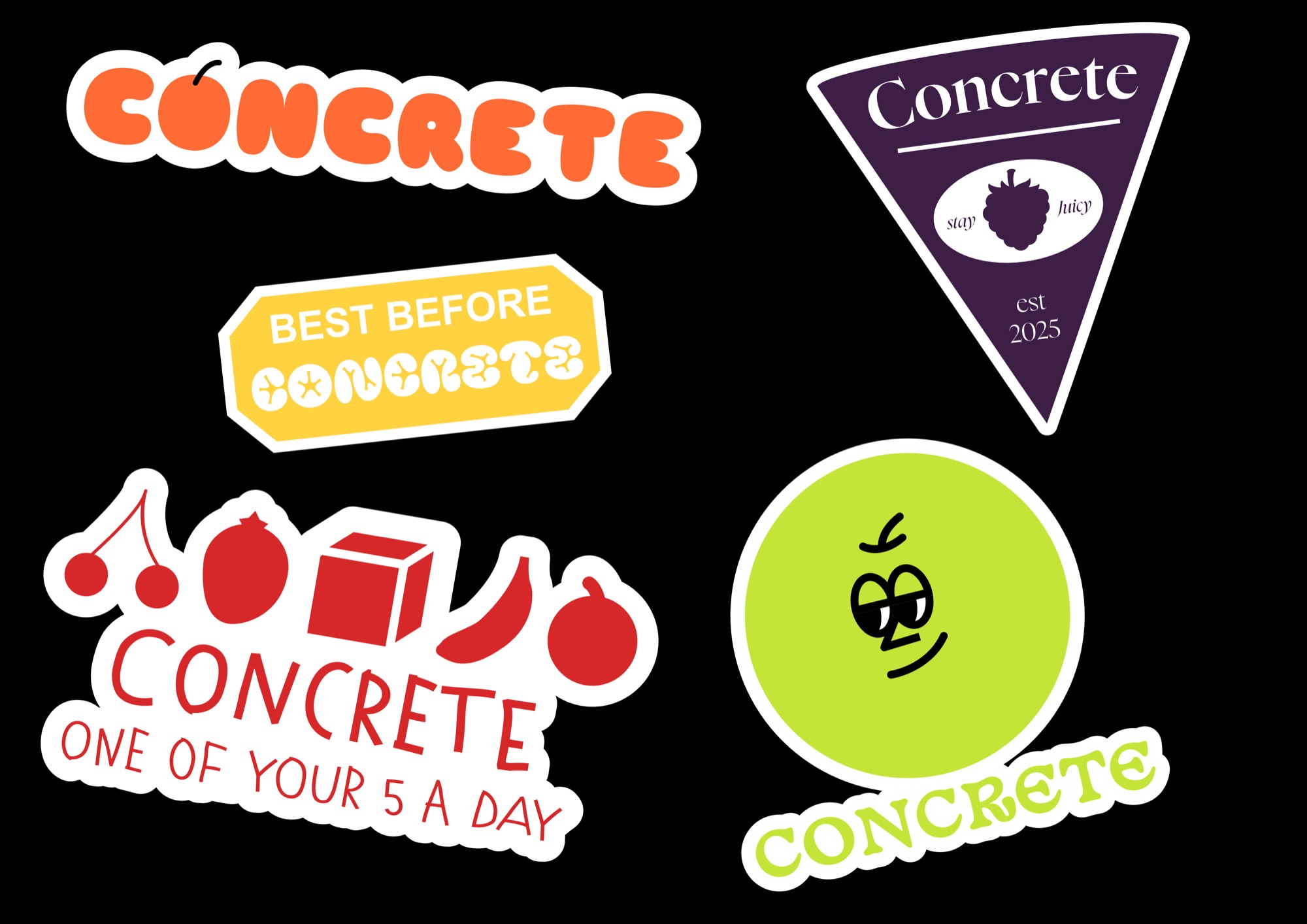
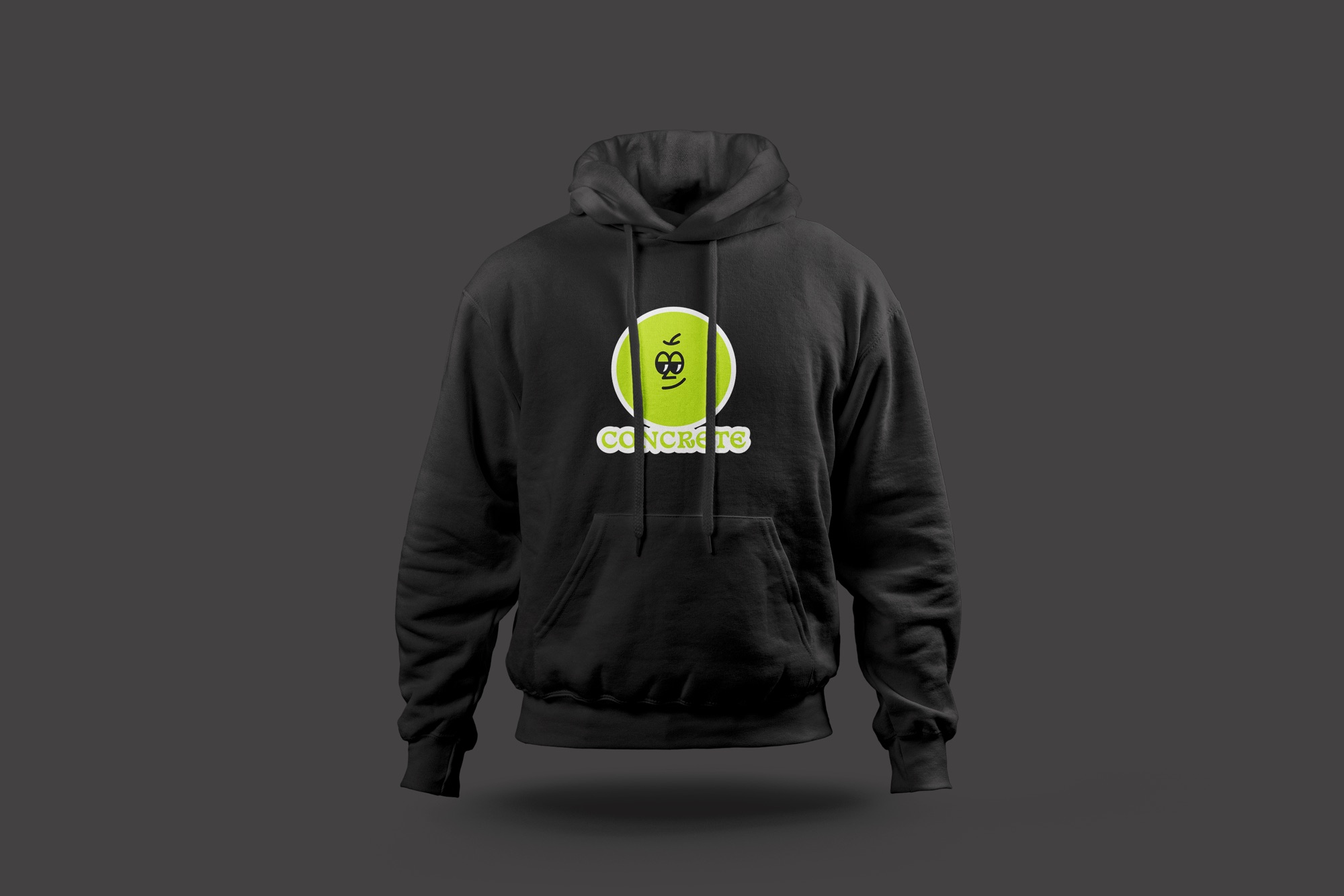
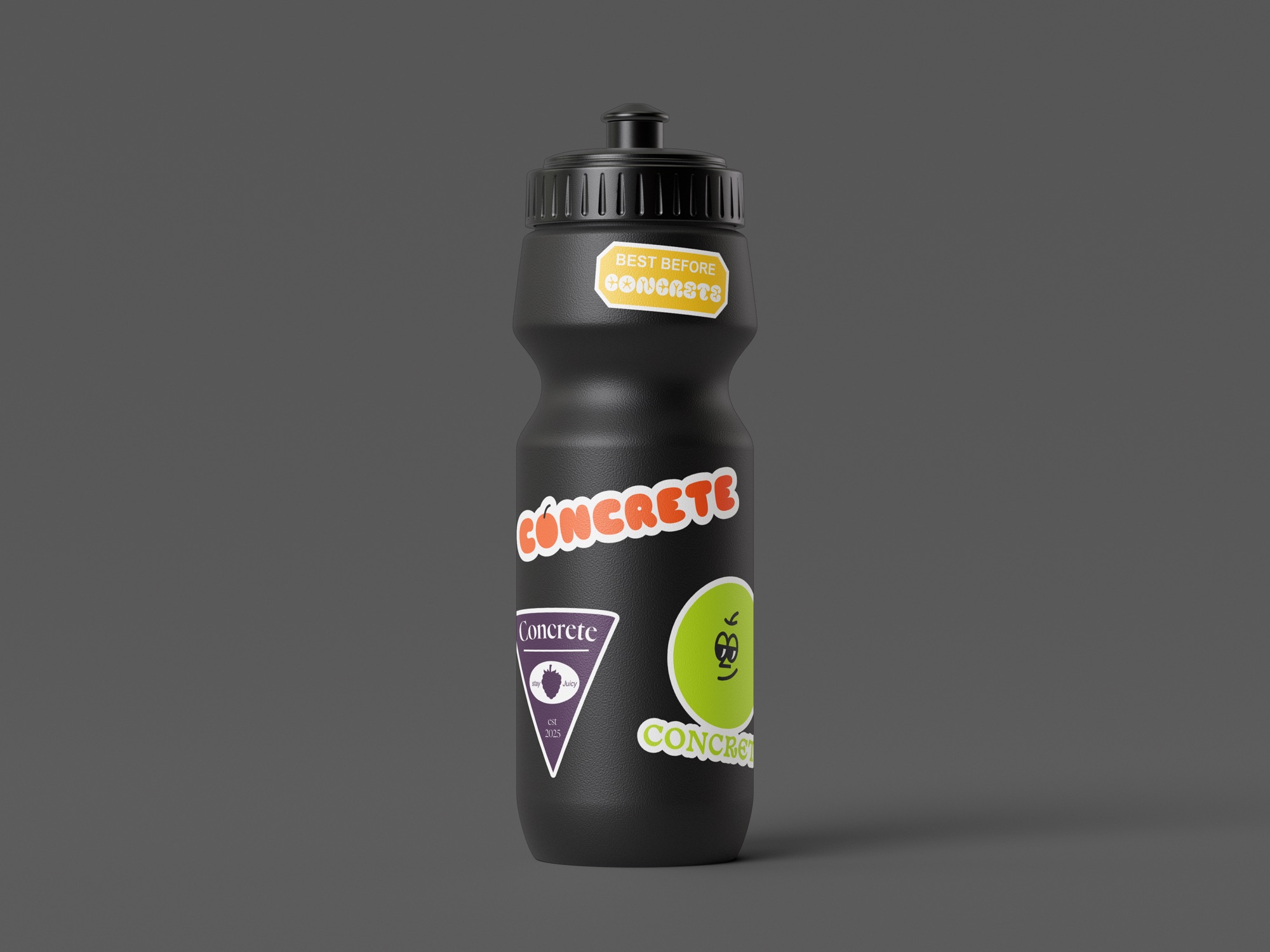
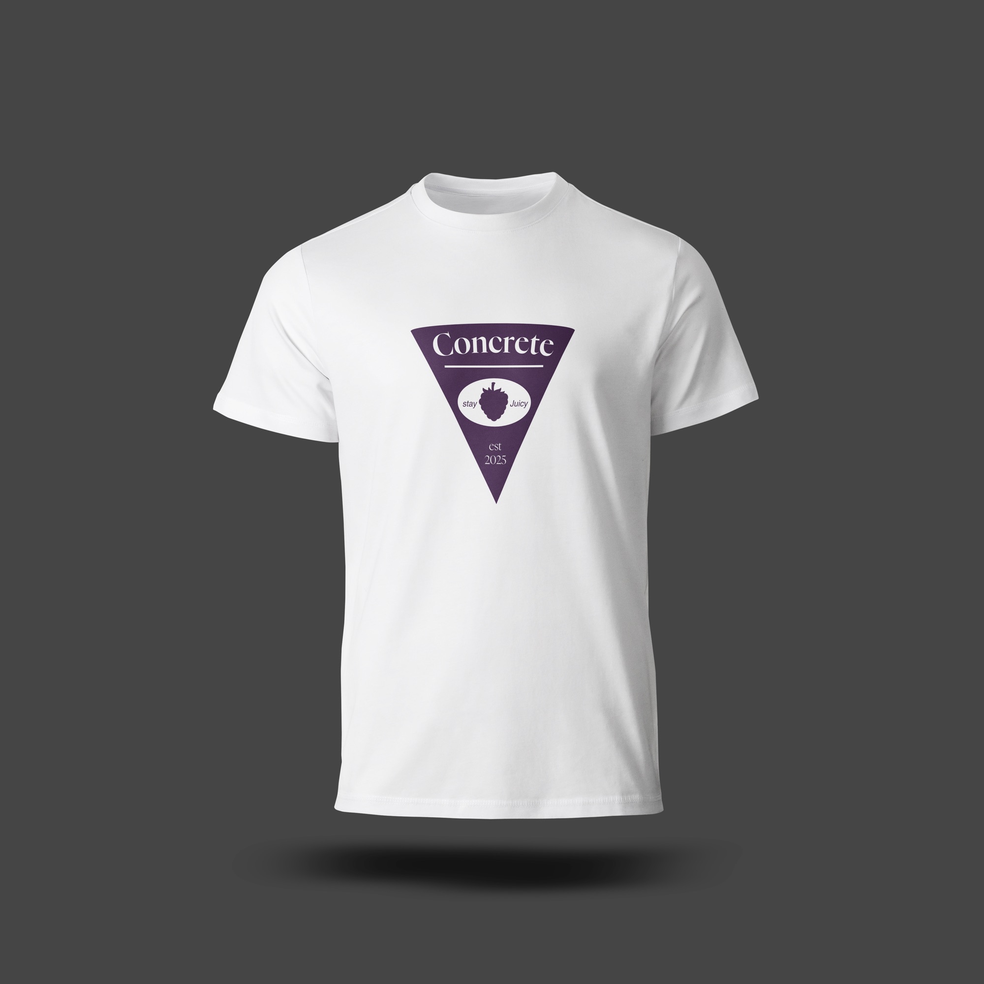
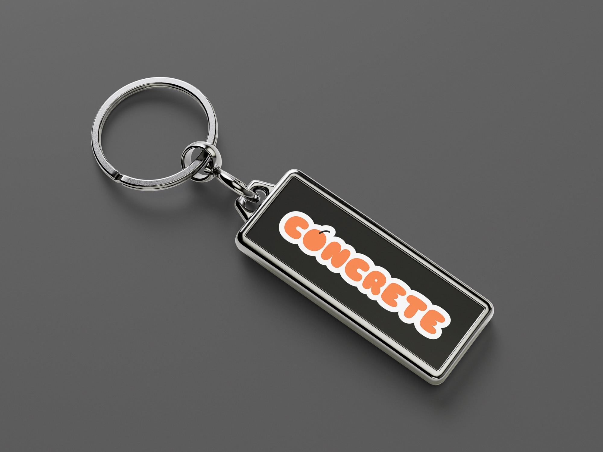
Concrete is a conceptual urban clothing brand, inspired by 80s skate culture, built for Millennial and Gen-Z audiences. This self-initiated brief was to design a series of pop art, fruit inspired badges and crests for a new range of clothing and merchandise with a humorous theme. The brief asked for a final outcome which has the versatility to work across a range of mediums like T-shirts, flasks, stickers and other branded merchandise, whilst keeping a typographic approach.
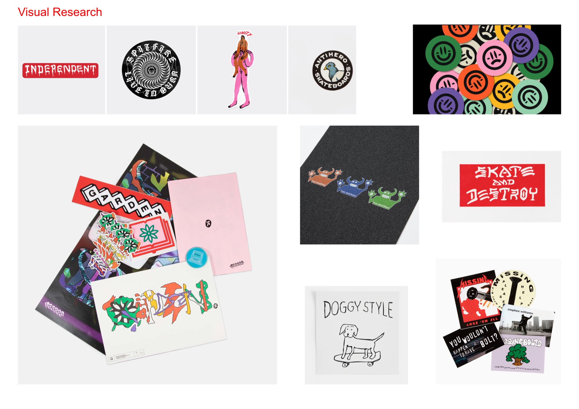
Research started with looking at competitor skating brands, like Dungeon and Garden, and noticing that successful products varied with their designs, from illustrations, type and photography. Humour was a theme throughout all the skater brands I looked at, but the approach was more ironic, ignorant and visual rather than corporate copies aiming to be funny. Exploring an approach like this would help keep the designs versatile and able to work across a variety of mediums, rather than just stickers.
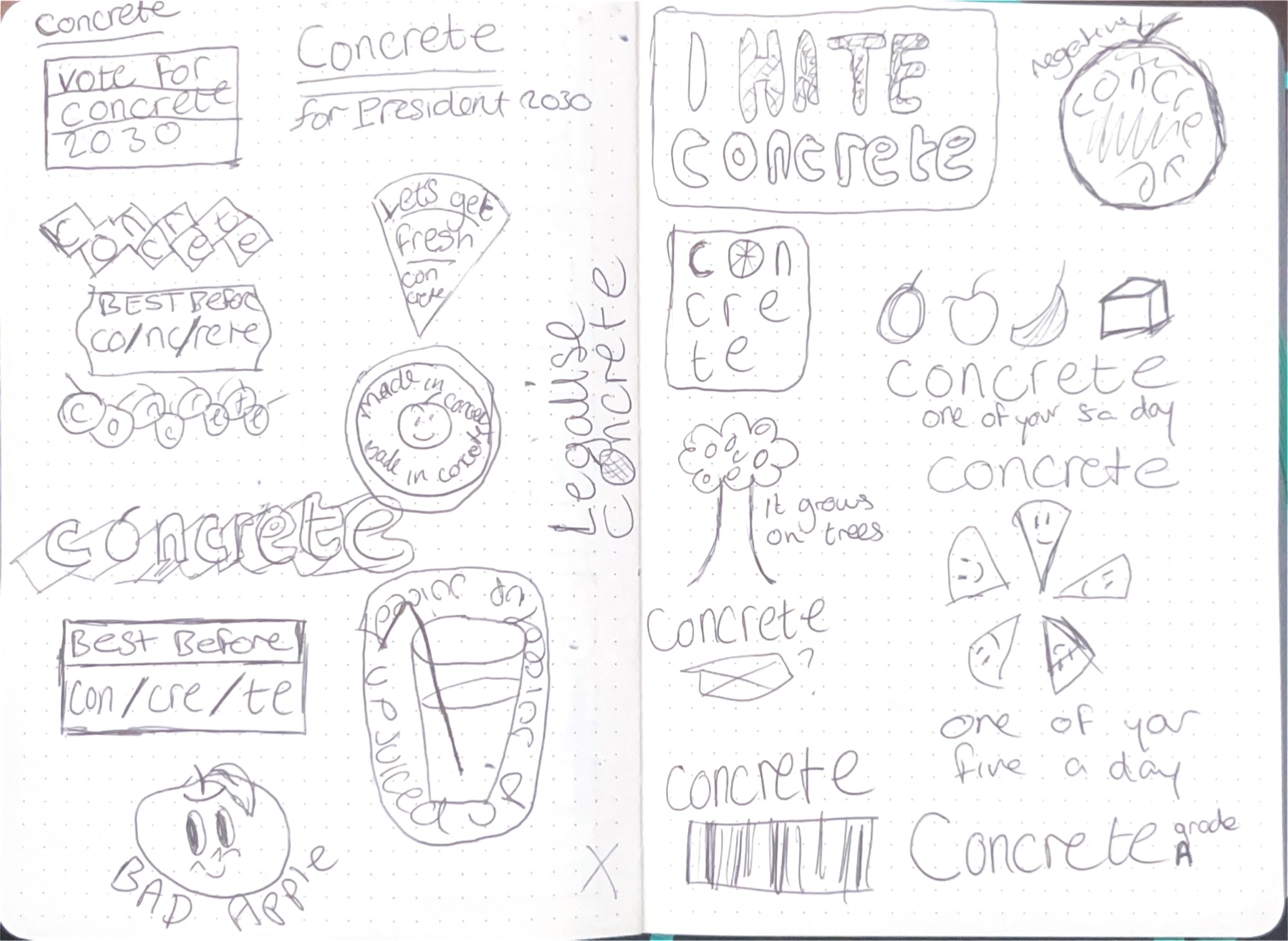
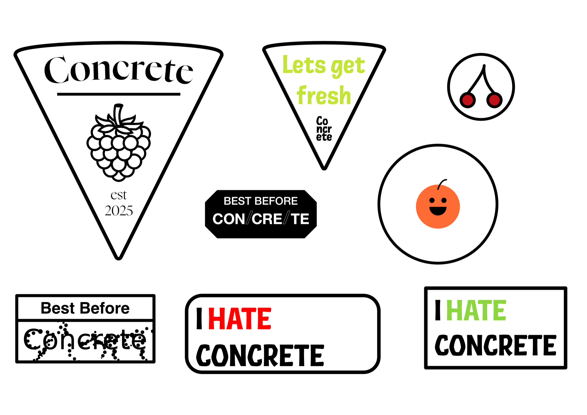
Earlier iterations in the design process explored using simple fruit illustrations, but I felt this missed the mark by itself. This led me to start exploring less direct fruit references, like best before stickers and fruit shaped badges. I then picked a pop art, fruit inspired colour palette to start tying the varied approaches together into a coherent series, whilst keeping a core theme, as seen in my research into competitors. After developing designs further I realised that a skating brand called Concrete releasing a fruit inspired merchandise line has enough irony itself, and a similar approach would help unify the series, whilst keeping enough variety and versatility.
The badges responded to the brief by keeping the desired pop art, fruit inspired theme by using vibrant fruit colours and simple illustrations, and also inspired by the ignorant and ironic style of successful competitors. Responding to the humorous theme mentioned in the brief, I kept it simple and ironic by using the concept of the brief as the main focus, a brand called Concrete releasing a fruit inspired line. This then allowed for the badges to be more than just stickers and work on a variety of mediums, without having extra lines of text to consider. If I was to push this further I would take it from a brief about designing badges, to be used for merchandise in a new range, to designing the full range and accompanying campaign to launch it. Overall, these design decisions led to a successful final outcome, which responded to all points in the brief.